 Skip to content
Step-by-Step Guide: How To Convert PSD To Responsive Email Templates
For anyone wondering what it really means to convert those gorgeous design files in PSD to responsive email templates without taking coffee on IV, we wrote up a little step-by-step guide.
Let’s break down the steps.
First—What Even Is PSD to Responsive Email Conversion?
A PSD (Photoshop Document) file contains all the design elements of your email created in Adobe Photoshop. Images, text, shapes, and effects—organized in layers. This format gives designers tremendous flexibility. It allows them to edit individual elements without affecting the rest of the design.
However, PSD files aren’t meant for direct use in emails. Most email clients can’t display them. And their large file size makes them impractical to send. While you could technically attach a PSD file to an email, recipients would need Photoshop or similar software to view it.
The best way forward is to turn your PSD design into HTML. During this conversion, developers translate the visual elements from your PSD into HTML code that email clients can render properly. The resulting HTML files are smaller, universally viewable, and don’t require special software.
If you are wondering if responsiveness matters when converting PSD to HTML email template, here’s your stat of the day: Around 71.5% of consumers primarily check emails on mobile. So yeah, you can’t neglect the mobile-friendliness of your email templates.
Once you convert PSD to responsive email templates, they reside in your email design system as reusable assets. You can turn to them for different campaigns and modify them to suit your needs.
Many marketers underestimate the importance of quality PSD to HTML conversion. For your emails to maintain their visual integrity across quirky email clients, a well-crafted HTML email template is fundamental.
Now, you don’t need PSD-to-responsive email conversion services to tell you how important it is to convert a PSD into HTML email. You need one to do it right.
Step 1 – Prepare Your PSD File for Conversion
First, you prep your PSD file for conversion inside Photoshop. Set up your Photoshop canvas between 600-800 pixels wide. Any wider, and you risk your email getting awkwardly cropped in some email clients
Step 2 – Slice Your PSD Design
Divide your PSD design into slices. This simplifies the PSD-to-responsive email conversion process. Each slice stands for a separate element in the email template. Think header, footer, or body.
Use the slice tool in Photoshop or manually select areas and export them as individual image files, usually in PNG or JPEG format.
The split-up design creates ground for a more manageable conversion. In the later stages, it lets you organize your code structure.
Step 3 – Code the HTML Structure
Create the HTML structure for your email template. Arrange your content using tables with rows and columns. I know it’s 2025, and the tables feel very 1999. However, it works best as major email clients support it well. So inconsistent rendering across platforms does not haunt your email team.
Step 4 – Insert Images Into The HTML Code
Add the sliced images in the right places of your HTML code. Do this by using absolute URLs for image sources. This helps them display correctly in email clients.
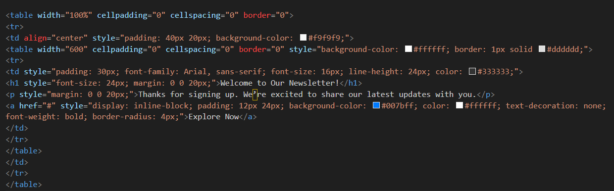
Step 5 – Apply Inline CSS for Styling
You want to make your email template look exactly how you imagined. Adding styles like colors, fonts, and spacing directly inside the HTML code is a surefire way to achieve that. This is called inline CSS. Many email programs don’t read separate style files. Email clients like Gmail and Outlook often strip out <style> blocks.
Embedding styles inside the code keeps your design renders consistent, be it text styling, padding, backgrounds, or buttons.
An example that shows inline styling in an HTML email template—
Step 6 – Make Your Email Template Mobile-responsive
This is a crucial step when you convert PSD to responsive email—don’t skip it! Responsive design makes your email look great, no matter if it’s read on a phone, tablet, or desktop.
Use responsive email design techniques that make your HTML email template adapts to the different screen sizes and devices.
- Apply media queries inCSS for adjusting styles as per screen size. These act like conditional instructions telling the email: “If the screen is smaller than X pixels, change these specific elements.
- Make columns stack vertically and skip side by side arrangement. Also consider bigger font sizes for readability, and make images scale to fit the screen width.
- Go all in for percentage-based widths for tables and images rather than fixed pixel sizes to create a fluid layout.
Important>> Some email clients have limited CSS support. So testing media queries and using fallback styles should become your muscle memory.
Step 7 – Test the Converted Responsive Email Template
You’ve built it. But will it adjust to different screen sizes? Hence, the all-important email testing.
Use tools like Litmus and Email on Acid to preview how your email looks in different email clients. Check rendering, loading speed, broken links, and layout consistency. Catching bugs here is way better than discovering them post-send.
Step 8 – Include a Plain Text Version
Don’t forget the plain text fallback!
No matter what you do, some email clients or recipients won’t render HTML reliably. Including a plain text version conveys the core message of your HTML version. Hence, the deliverability and accessibility of your email remain untouched when the HTML email fails to render.
It’s a small but heart-warming gesture that shows you care about every subscriber’s experience.
Consider Professional Services
It’s understandable if you’re not comfortable doing this yourself. I mean not everyone is equipped to juggle the technical intricacies of HTML email coding.
Some of us would rather focus on strategy and content than debugging why that blue button renders green in Outlook 2016. Plus, the hours you’d spend troubleshooting could be better invested elsewhere in your marketing efforts. In such cases, you can use professional services like Email Mavlers or xChop.
How To Ensure Your PSD to HTML Email Conversion Is Responsive
- Design your PSD design with flexible grids from the start. It lets your content breathe and adapt when someone’s checking your email during their morning commute.
- Single-column layouts just work better on mobile devices. People don’t want to pinch and zoom. They’ll just delete your email instead. Same goes for images – make them scale properly.
- Font size matters more than you think. 16px minimum keeps things readable for mobile users.
- Buttons need to work with actual human fingers. Make them at least 44px x 44px .
- Always add descriptive alt text to images. If, on mobile, an image doesn’t load, the alt text will tell the user the context.
- Avoid unnecessary design complexity. A clean and simple email design always trumps when it comes to mobile readability.
- Compress those images! It prevents slow-loading emails for mobile users. Tools like TinyPNG help you reduce image file size, keeping the image quality intact.
Conclusion
Converting PSD to responsive email templates needs technical expertise. The time and resources you’ve poured into creating your designs deserve proper implementation. Whether you tackle this yourself or bring in the experts, these best practices aren’t optional if you want results.
The resulting email templates maintain visual integrity, function well, and offer a great experience for all subscribers. Your subscribers might not consciously notice the difference, but their engagement patterns tell the real story.
