10 Techniques Guaranteed to Increase Your Shopify Conversion Rate
1. Introduction
Given the preponderance of eCommerce websites, including those on the Shopify platform, how do you differentiate your offering from the surrounding babble? How do you ensure that prospective customers visiting your website end up making a purchase, which is the website’s raison d’ etre? Customers are spoilt for choice – on the Shopify platform itself, there were over 1.25 million active eCommerce sites at last count. While moving from one physical store to another is time-consuming, switching from one website to another is just a mouse-click away. Hence, your online store needs to be captivating enough to attract and retain potential customers, and then entice them into making a purchase from among the products offered. We have spoken about Search Engine Optimization (SEO) strategies in our earlier blogs. A good SEO strategy will attract traffic to your site, a good user experience and product mix will make them stay on, implementing the right conversion techniques will guarantee that the visit converts into a sale.
Before we move into the techniques to increase the Shopify conversion rates, let us first analyse the top 3 trends driving consumer behaviour in eCommerce.
2. Trends influencing online shopping
Before we move into the techniques to increase the Shopify conversion rates, let us first analyse the top 3 trends driving consumer behaviour in eCommerce.
Trend 1: As a first step, let us understand what we are faced with when we set out to increase our conversion rate. Shopify offers an analytics service, Littledata (https://www.littledata.io/shopify), which measures current conversion rates across all its websites. According to the shopping analysis done by Littledata, in 2019, the average Shopify conversion rate was 1.5% and the average order value was $63.50. The conversion rate is graphically depicted below. If your conversion rate is above 3.6%, your website is among the top 20 percentile of Shopify websites.
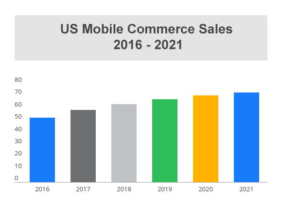
Trend 2:Moreover, there has been an exponential growth in Shopify eCommerce purchases done through smartphones compared to desktops. This is driven by higher quantum of discretionary and impulse purchases using the more handy mobile phone devices compared to the more tedious desktops, for which the user needs to sit in front of a screen, boot the system and then start browsing. Even though mobile eCommerce is currently at about half the desktop transactions, this scenario is fast changing as newer, faster handsets hit the market, and as website designers focus on making their eCommerce websites more compatible for mobile devices – the world has already begun differentiating between eCommerce (using desktops and tablets) and mCommerce (using mobiles), with an increasing focus on improving mCommerce statistics.
Trend 3:Google Analytics studies on all eCommerce websites show that returning visitors or repeat customers are more than twice as likely to buy a product from your online store as a first-time visitor. While the conversion rate for first-time visitors is 1.9% that for a returning visitor is 4.2%. Further, the conversion rates are highest for visitors who come via referrals, with visitors reaching your site through organic search engines like Google ranking next, and those who come through social media marketing like Facebook coming in at third spot.
3. Techniques to improve Shopify Conversion rates
Shopify provides a default dashboard showing your site’s conversion rates at each stage of the conversion funnel. Focusing on the bottlenecks in this funnel is the simplest means of improving your conversion rates. Apart from this, given the above trends in Shopify eCommerce, here are the top 10 techniques guaranteed to improve your Shopify conversion rates.
Store structuring
Customers should be able to identify the placement of different products within your online store at first glance. The product categorization and placement should be at a manageable level without too many branches and sub-branches. The simplest store structure could be as easy as: Homepage ? Product Category ? Sub-Category ? Product. The use of generic terms for product names and in product descriptions drives traffic to them and helps in conversion rates. For example, instead of just giving the brand name of a product (like “Burberry”, the brand name can be combined with the product category name (like “shirt” or “trouser” or “suit”).
Optimize your store for mobile users
With more and more customers preferring to browse and shop on their mobile phones, ensure that the product images, screen loading time, pixel and layout of your store are synchronous with mobile phones. Discounts and checkout formalities should also be aligned for mobile users.
Improve site speed
64% of mobile users expect a page to load in 4 seconds or less while half of the users expect it to load within 2 seconds of the click. Slow loading speeds are a killjoy and result in customers switching over to alternate websites. According to a study, over 45% of visitors get turned off and switch to an alternate website the moment they experience slow pages, no matter at which stage of the purchase they are in; another study shows that 79% of dissatisfied first-time visitors do not visit the website again nor do they make any purchase. This means slow loading speed results in a sure-shot loss of 45% conversion rate, and also causes a long-term loss of 36% (79% of 45%) potential customers.
Realistic product images and description
As Amazon would vouch for, honesty pays in online eCommerce. Product images and descriptions need to be honest and realistic – customers value transparency. This is also a good policy if you wish to avoid product returns and replacements. At the same time, the product images need to be of a high quality. Since customers cannot touch, feel or try on the products available online, the products have to come alive on their screen with the imaginative use of photography. There is always a trade-off between the quality of images and the loading speed of the webpage showing these images.
No 404 errors
Do not leave dead ends on your website. Any dead ends due to discontinued or unavailable products can be converted into a navigation page leading the customer on to related products or categories. This will ensure the customer stays on with your Shopify website till the proper product selection is done and the purchase is completed.
Use of discounts and offers to create FOMO and urgency
FOMO or the “Fear Of Missing Out” is a commonly used technique among e-marketers. This is often used in conjunction with attractive time-bound discount coupons to create a sense of urgency among customers forcing them to buy the product or risk losing out on what seems to be an attractive deal.
Allow guest logins, even at checkout
Over 25% of shoppers abandon their carts just before checkout because they are told to create an account to proceed further. Today’s customer is impatient and impulsive. She browses through your website on her mobile because she could not be bothered to sit at a desk and boot a desktop or laptop. She will definitely not take too kindly to a long-drawn process which asks her to enter all her personal details, set up a password and create an account. It could be an option for those willing to do it but it cannot be a compulsion – the shopper should be allowed to complete the sale without having to create an account.
User ratings and reviews
Whether positive or negative, these have to be honest and realistic. Today’s customer cannot be taken for a ride – she is aware enough. A study by AC Nielsen shows that 60% of online shoppers make their purchase decision after going through the product reviews published on the website. User reviews on the product page allows you to build trust with your customers.
Search functionality
While the traffic to your website may be driven organically through search engines, once the customer comes to your website, he or she may wish to explore your website further for the specific product which they had searched for, or for related products. It is always a good idea to provide an in-site search functionality. Studies show that visitors who use a site’s in-house search functionality are almost twice as likely to convert into customers. This may be because search engines direct them to more generic results while your website’s search engine allows them to be more specific, and thus can direct them to an exact match of what they are looking for.
Shipping
Last but not the least, half the shoppers can come to the last stage of the buying process but then abandon their carts either because there is a shipping cost associated with the purchase, or because they find the shipping cost to be too high. While shipping may be a genuine cost, customers do not perceive it as such, and find it an additional burden. Try to offer free shipping or minimize the shipping cost – if it is not possible, be upfront about the shipping cost associated with the product so that customers do not feel cheated or dissatisfied after having made the effort to select all the products and build up their carts.
4. Conclusion
We hope the above tips help you to improve your Shopify conversion rates. Do write in to let us know if this article has been helpful to you. Stay tuned for more advanced tips on how to improve Shopify conversion rates, including the use of FAQs, live chats, refund policies, integrated social media campaigns and follow-up strategies for both, those who made the purchase and those who did not. All the above tips can be easily implemented on your online store to increase conversion rates and sales. The above tips may undergo changes as customer preferences and demographics change and new user behaviours evolve – so too, must your website! And we can show you how, in the fastest and most economical manner.


