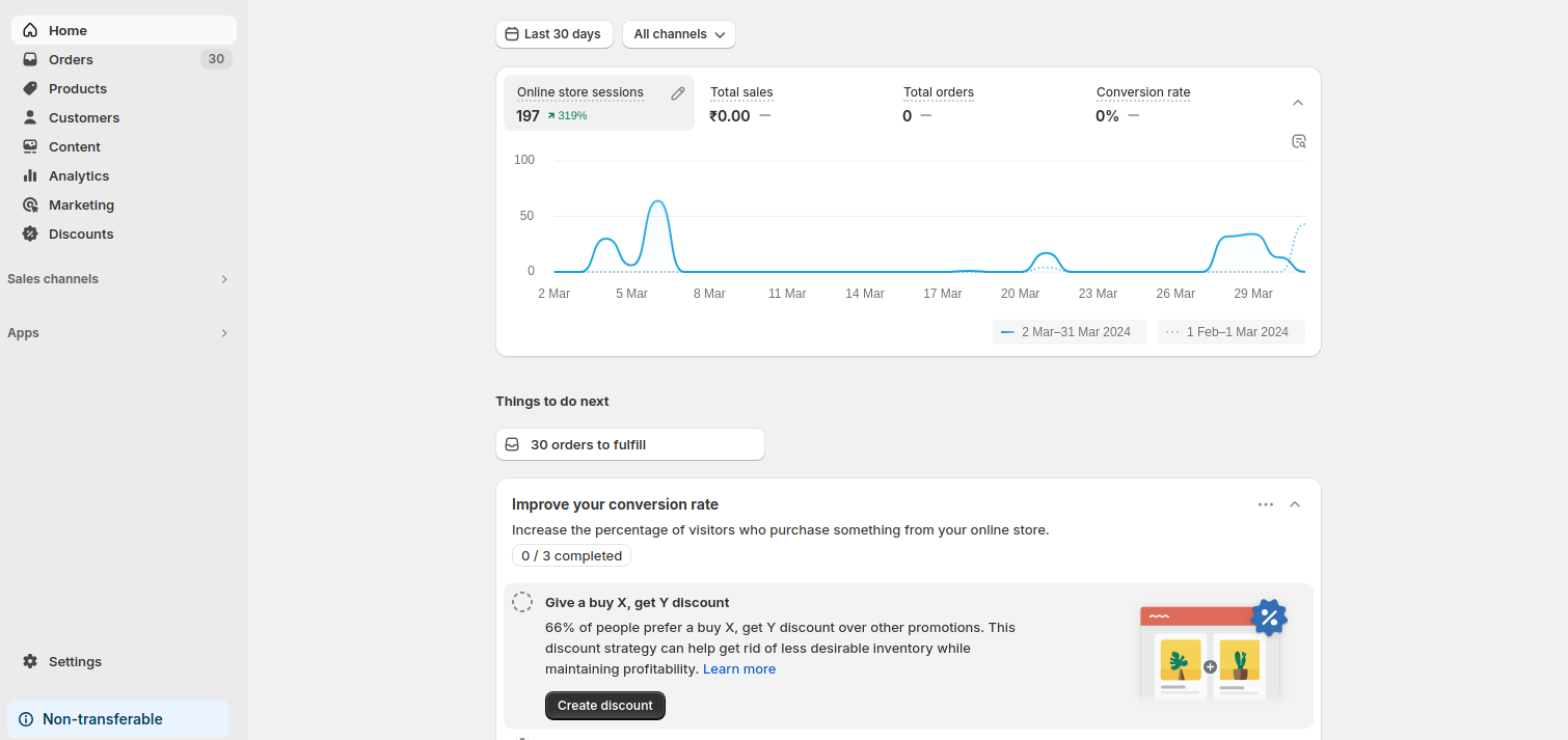
How can Polaris Components improve your Shopify store?
Introduction
Do you ever feel like your Shopify store needs a little more cohesion? Maybe your admin interface lacks a consistent look and feel, making it difficult for customers to navigate and complete tasks. If so, you’re not alone. But there’s a solution: Polaris.
What is Polaris?
Polaris is Shopify’s design system, a comprehensive toolkit that empowers developers and designers to create seamless and user-friendly experiences within the Shopify admin environment. It provides a library of pre-built, reusable components that ensure consistency, accessibility, and ease of use.

Key Features of Polaris
- Consistency: A unified design language across the Shopify admin interface.
- Accessibility: Components built with accessibility in mind, ensuring everyone can use the platform easily.
- Ease of Use: Pre-built elements that save time and effort for developers while maintaining a polished, professional look.
Why Use Polaris?
Polaris isn’t just for Shopify’s internal teams. It’s also accessible to external developers who create apps for the Shopify App Store. This inclusivity fosters a collaborative environment where everyone can leverage the power of Polaris to create a better experience for Shopify merchants.
Benefits of Polaris for Developers and Merchants
- Seamless Integration: Ensures apps integrate seamlessly into Shopify’s ecosystem.
- Collaboration: Developers can easily align their apps with Shopify’s design standards, fostering a collaborative and cohesive environment.
Better User Experience: By using Polaris, developers can create an intuitive and smooth interface, ultimately enhancing the merchant’s experience.
How Does Polaris Work?
Polaris works by providing a set of pre-designed components that developers can easily incorporate into their Shopify apps and the Shopify admin interface. These components are built with best practices in mind, ensuring a high-quality, consistent experience across the entire platform.
Polaris + App Bridge: A Winning Combination
Polaris provides the design guidelines, while App Bridge helps with the technical side of integrating apps into the Shopify admin interface. Together, they enable developers to create apps that look and feel like native Shopify features, ensuring a seamless user experience.
Ready to launch your Shopify store? We will create a standout site with our development and app development to build a store that sells.
Contact us now and get your store up and running fast!
What Are the Key Components of Polaris?
At the heart of Polaris lie its components – reusable elements that form the foundation of the Shopify admin interface. These components range from basic buttons and navigation bars to more complex layouts like cards and forms. Each component is meticulously designed to guarantee consistency, usability, and accessibility across the platform.
Key Component Categories
- Actions: Components like buttons, button groups, and page actions allow merchants to perform various tasks within the interface.
- Layout and Structure: These components provide the framework for building different sections and pages within the admin. Examples include layouts, grids, cards, and dividers.
- Selection and Input: Interactive components like text fields, checkboxes, and dropdown menus enable merchants to input data and make selections.
- Images and Icons: Visual components like avatars, icons, and thumbnails enhance clarity and understanding within the interface.
- Feedback Indicators: Badges, banners, and progress bars that provide users with feedback and status updates.
- Typography, Tables, Lists, Navigation, and Utilities: These foundational components ensure that all elements on the platform have a consistent look and behavior.
How to Leverage Polaris for Your Shopify Store or App?
1. Design with Consistency
When building your Shopify app or store, ensure that your design adheres to Polaris’ guidelines. This ensures your app will feel familiar to users and fit seamlessly into the Shopify ecosystem.
2. Use Reusable Components
Instead of creating custom components from scratch, leverage Polaris’ pre-built, reusable components to save time and maintain consistency.
3. Focus on User Experience
Polaris components are designed to improve usability, so make sure to use them in a way that enhances the merchant’s workflow, providing a smoother and more intuitive experience.
4. Integrate with App Bridge
For app developers, use App Bridge to ensure your app integrates properly with Shopify’s admin interface, providing a unified experience that works well with the platform.
Conclusion
By leveraging Polaris components, developers and designers can create a more cohesive and user-friendly experience for Shopify merchants. This not only enhances the merchant experience but also strengthens the Shopify ecosystem overall. So, whether you’re building a Shopify store or app, consider embracing the power of Polaris to streamline your design and development process.


