How to Build an Interactive Color Picker in Shopify
Introduction
In this article, we’ll show you how to create a responsive color picker in Shopify using Shopify Polaris. This component allows users to select and preview color changes dynamically, which can be very useful in applications where color customization is required. We will focus on building a color picker with state management, enabling real-time color updates for users.
What is Shopify Polaris and How to Use Its Components?
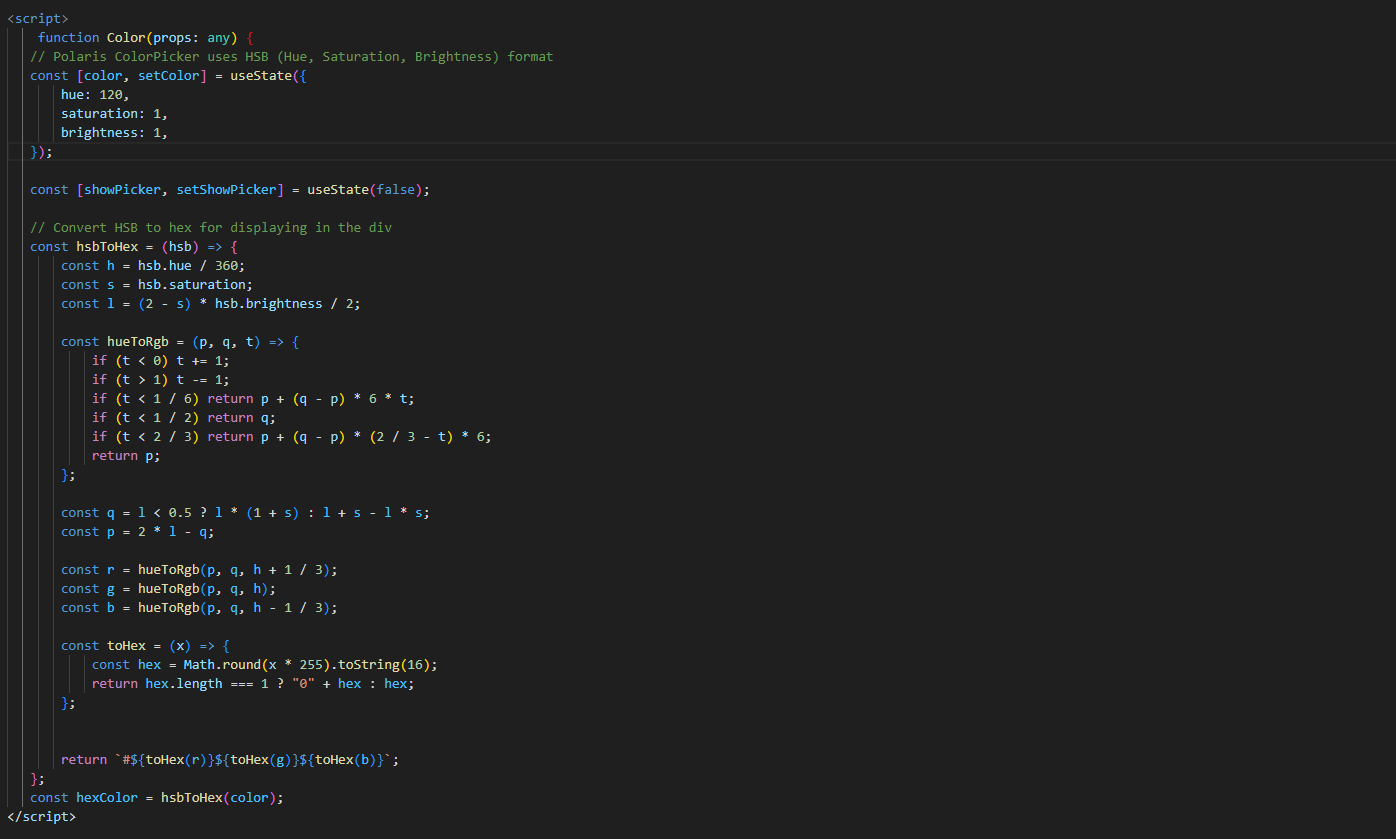
The Shopify Polaris framework provides a set of React components designed to create a consistent user interface for Shopify apps. Among these components is the ColorPicker component, which lets users pick colors in HSB (Hue, Saturation, Brightness) format. However, to make it easier for display and styling, we can convert the color values to Hex format. In the following example, we’ll dynamically update the color picker’s state based on user input.
How Does the Code for Color Picker Look?
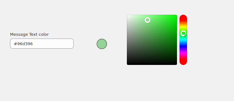
What is the Output of the Color Picker?
Upon clicking the color circle, the selected color will dynamically change. This allows for real-time preview and selection.
Ready to launch your Shopify store? We will create a standout site with our development and app development to build a store that sells.
Contact us now and get your store up and running fast!
Why is State Management Important in Building the Color Picker?
How Does State Management Work with useState?
We initiate two states:
- color: Holds the HSB values of the selected color.
- showPicker: Controls the visibility of the color picker tool.
How is HSB to Hex Conversion Done?
To display the color in the component, we convert the HSB format into Hex format, which is more easily used in HTML and CSS.
How Does Event Handling Work in the Color Picker?
The ColorPicker component listens for user interaction. When a color is selected, the color changes. We also manage the visibility of the color picker using setShowPicker, which allows the user to toggle the color picker’s visibility on or off.
How to Style the Color Picker Button for Better User Experience?
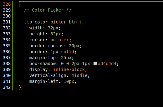
The CSS class .lb-color-picker-btn is used to style the color picker button, making it visually appealing and convenient for users to choose colors.
Why Should You Use Shopify Polaris for Building Color Pickers?
With the help of Shopify Polaris’s ColorPicker component and React’s useState, integrating a color picker into a Shopify app becomes quick and straightforward. This implementation allows users to select a color and preview their changes in real-time, enhancing the overall user experience and customization options.
Future enhancements could include the ability to incorporate additional colors, as well as other interactive features, to further improve the interactivity of your Shopify app.
Conclusion
With the help of Shopify Polaris’s ColorPicker component and React’s useState, integrating a color picker into a Shopify app becomes quick and straightforward. This implementation allows users to select a color and preview their changes in real-time, enhancing the overall user experience and customization options.


