Table of Contents
How to Create a Product Grid and List View Using jQuery Plugin on Shopify
In today’s fast-paced digital shopping environment, e-commerce websites, especially on platforms like Shopify, must prioritize user experience. Offering additional viewing options—like a grid or list—can significantly enhance usability and engagement. In this blog post, we’ll guide you on how to create product grid and list view using jQuery plugin to cater to diverse user preferences on your Shopify store.
Functionality Overview
This feature allows users to switch between different product display formats on your Shopify website. Instead of limiting the view to a grid format, users can also choose to see products in a list format. This functionality works seamlessly on both desktop and mobile devices, ensuring a smooth experience for all users.
How It Works
- Choose Your View: When you visit a website with this feature, you’ll see a button or an option to switch between different views – like a grid or a list.
- Click to Change: If you prefer seeing products in a grid with pictures, you click on the grid view option. But if you like things more organized in a list, you click on the list view option instead.
- See It Your Way: Once you’ve chosen your view, the website shows all the products in that style. You can easily switch back and forth between grid and list views whenever you want.
- Works Everywhere: Whether you’re using a big computer or a small phone, this feature works smoothly on all devices.
Configuration & Setup
Follow these steps to set up the feature on your Shopify store:
1. Adding the Custom jQuery Plugin
- Download the custom jQuery plugin provided by us.
- Place the plugin in your Shopify theme’s assets directory, such as in assets/custom-jquery-plugin.js.
2. Implementing in the Main Collection File
- Locate your main collection file (e.g., collection.liquid).
- Include the jQuery and plugin scripts in the section:
Ready to launch your Shopify store? We will create a standout site with our development and optimization to build a store that sells.
Contact us now and get your store up and running fast!
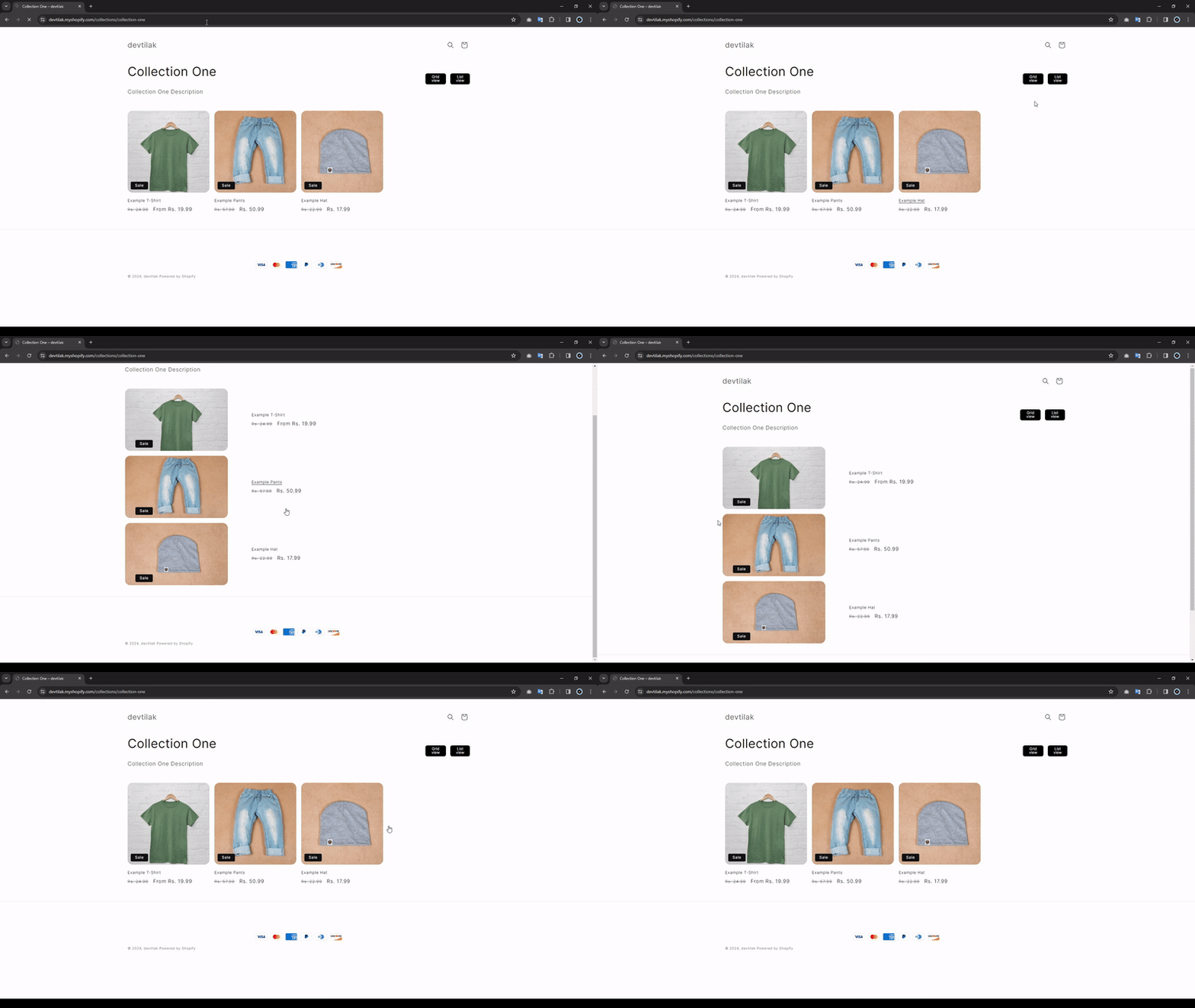
Desktop View:
On desktop devices, products will display in an appealing grid layout. Users can easily switch to list view for a more structured overview. This is especially useful when integrating masonry grid examples or other layouts, such as jQuery grid layout drag & drop.
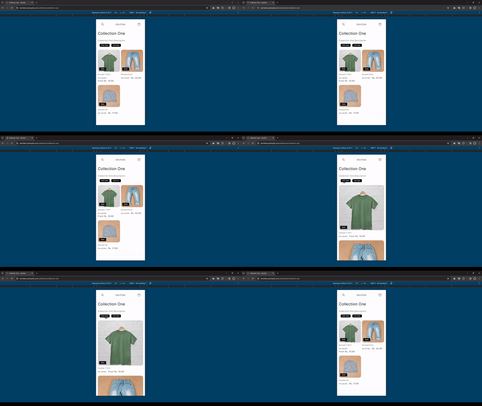
Mobile View:
The feature is fully responsive, ensuring that users on mobile devices enjoy a user-friendly experience, whether viewing products in grid or list format. Consider using an image grid JavaScript library for enhanced mobile responsiveness.
By following this structured approach, you can successfully create product grid and list view using jQuery plugin example, improving usability and enhancing the shopping experience for all users on your Shopify store.
Additional Resources
If you’re looking to expand your options for layout and design, consider exploring:
- Wookmark jQuery for dynamic layouts that adjust based on the screen size.
- Gridstack JS examples for flexible grid arrangements that allow for easy customization.
- Gridstack add widget dynamically to enhance interactivity on your site.
These resources can help you take your product display to the next level, ensuring your Shopify e-commerce site stands out in a competitive market.
Conclusion
Incorporating a product grid and list view into your Shopify store is a simple yet powerful way to enhance user experience. By following the steps outlined above, you can create a dynamic and responsive interface that caters to different browsing preferences. Not only will this improve customer satisfaction, but it can also lead to increased engagement and sales.


