 Skip to content
Table of Contents
How to Implement Responsive Banner Images with the Tag in Shopify
Introduction
When designing an ecommerce site, ensuring that all the responsive banner images are properly optimized for different devices is essential for usability. By using the Shopify
Why Responsive Banners Matter
Responsive web design is no longer optional—it’s a necessity. With mobile devices accounting for a large share of online traffic, it’s essential to provide correctly sized images for both desktop and mobile. Traditionally, serving separate desktop and mobile images created increased complexity and could impact performance due to the need for different elements.
The
How the Tag Works
The HTML tags, where:
- Specifies alternate images based on media queries or file types, helping with image adaptation for devices of different sizes and resolutions.
Acts as a fallback for browsers that do not support the
tag or when no suitable condition is met.
With this tag available in Shopify Liquid, you can easily serve optimized images for both desktop and mobile without issues, ensuring flexible banner design that adjusts to different screen sizes.
What Are the Benefits of Using the Tag in Shopify?
1. Better Performance
The
2. Cleaner Code Base
It eliminates the need for separate
elements or complex CSS for mobile and desktop views, resulting in cleaner, more maintainable code and a flexible banner design that adapts seamlessly.
3. Improved SEO and Accessibility
Efficient image loading helps improve Core Web Vitals, ultimately boosting SEO rankings. Additionally, using the alt attributes ensures that images are accessible for visually impaired users, supporting overall Shopify responsive images best practices.
4. Responsive Design
The
Ready to launch your Shopify store? We will create a standout site with our development and optimization to build a store that sells.
Contact us now and get your store up and running fast!
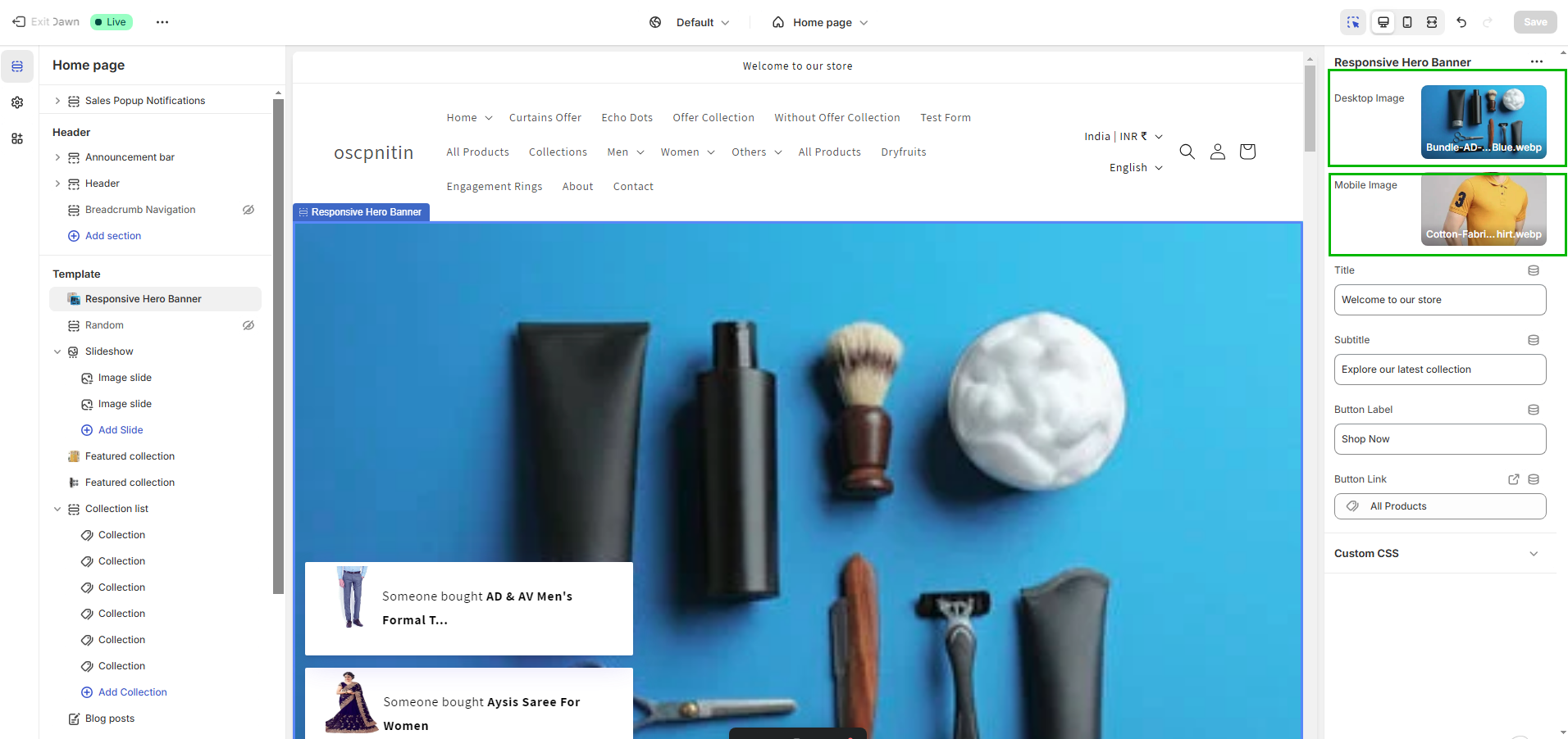
How to Implement Responsive Banner Images in Your Shopify Theme
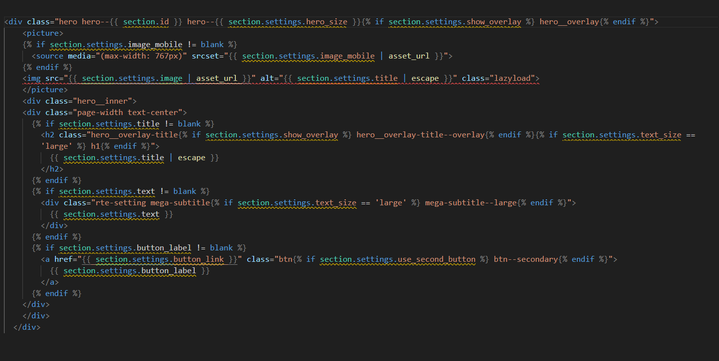
Here’s how you can set up responsive banner images in your Shopify theme using the
Liquid Code for the Banner Section
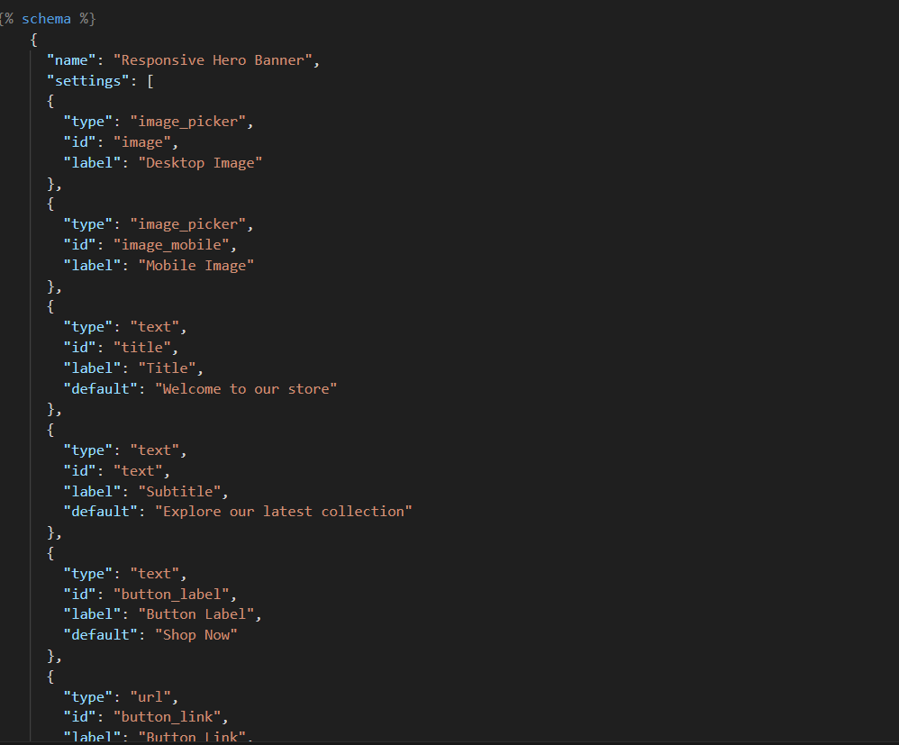
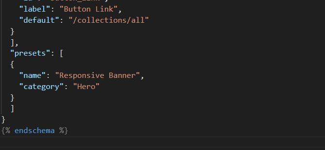
Customizing the Schema
You can add fields in your schema to allow the upload of both desktop and mobile images.
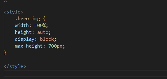
CSS for Mobile Optimization
Ensure that your images look good on various devices by adding responsive CSS:
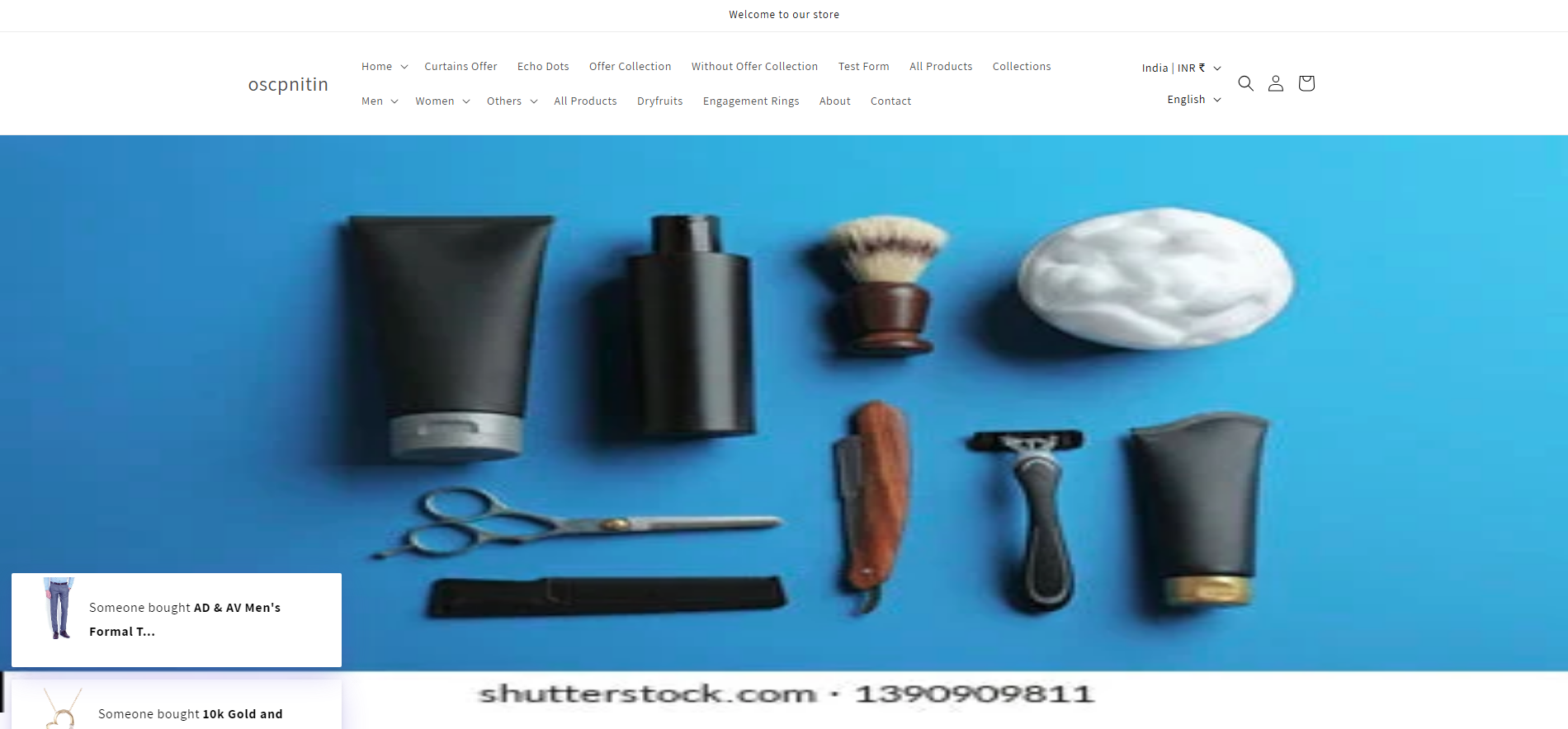
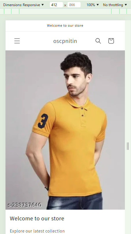
Customization Output:
Desktop View:
Mobile View:
Conclusion
Using the
By implementing Shopify responsive images and banner optimization for mobile, your store will automatically serve the best images suited for each device, creating a smooth, fast, and professional browsing experience for your customers. Whether it’s a large desktop monitor or a small smartphone screen, your banners will look fantastic with just a few lines of Liquid code and optimized images.
Pro Tip:
Always test your implementation across multiple devices and browsers to ensure consistent performance, particularly focusing on image adaptation for devices of all sizes.

